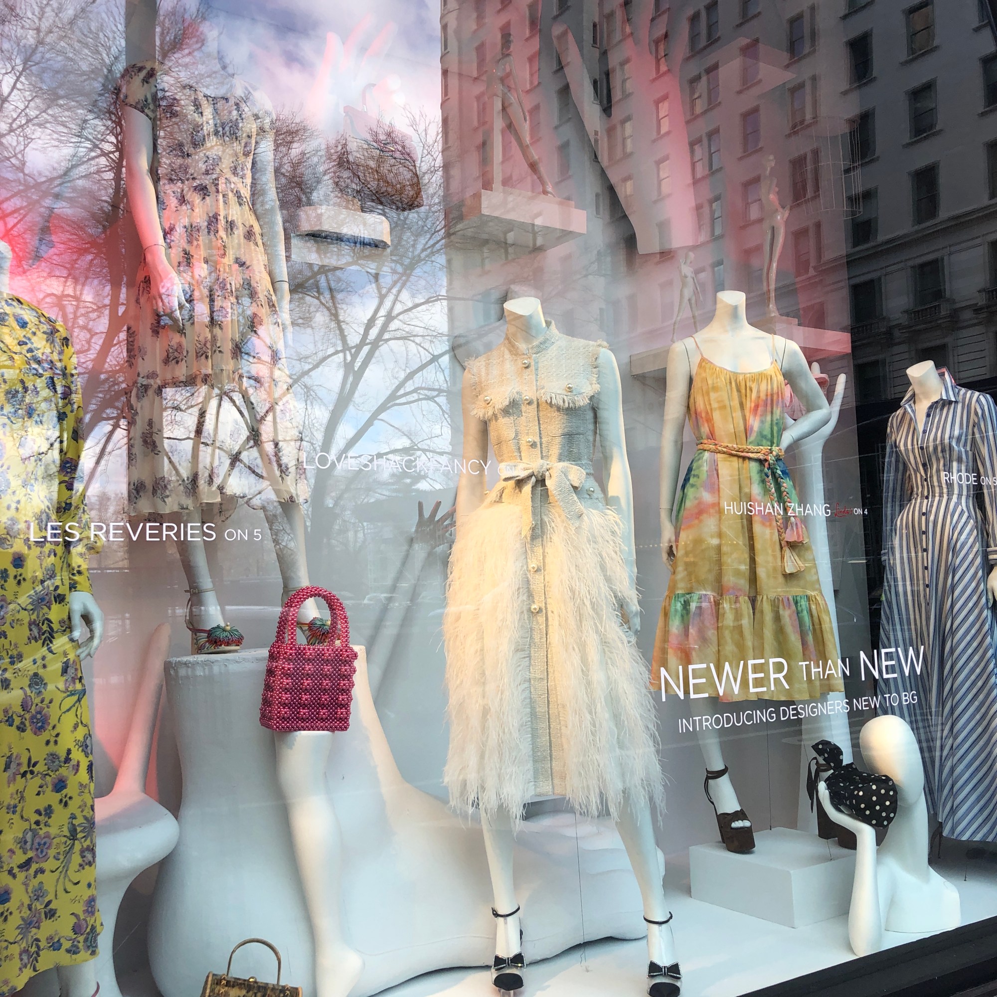
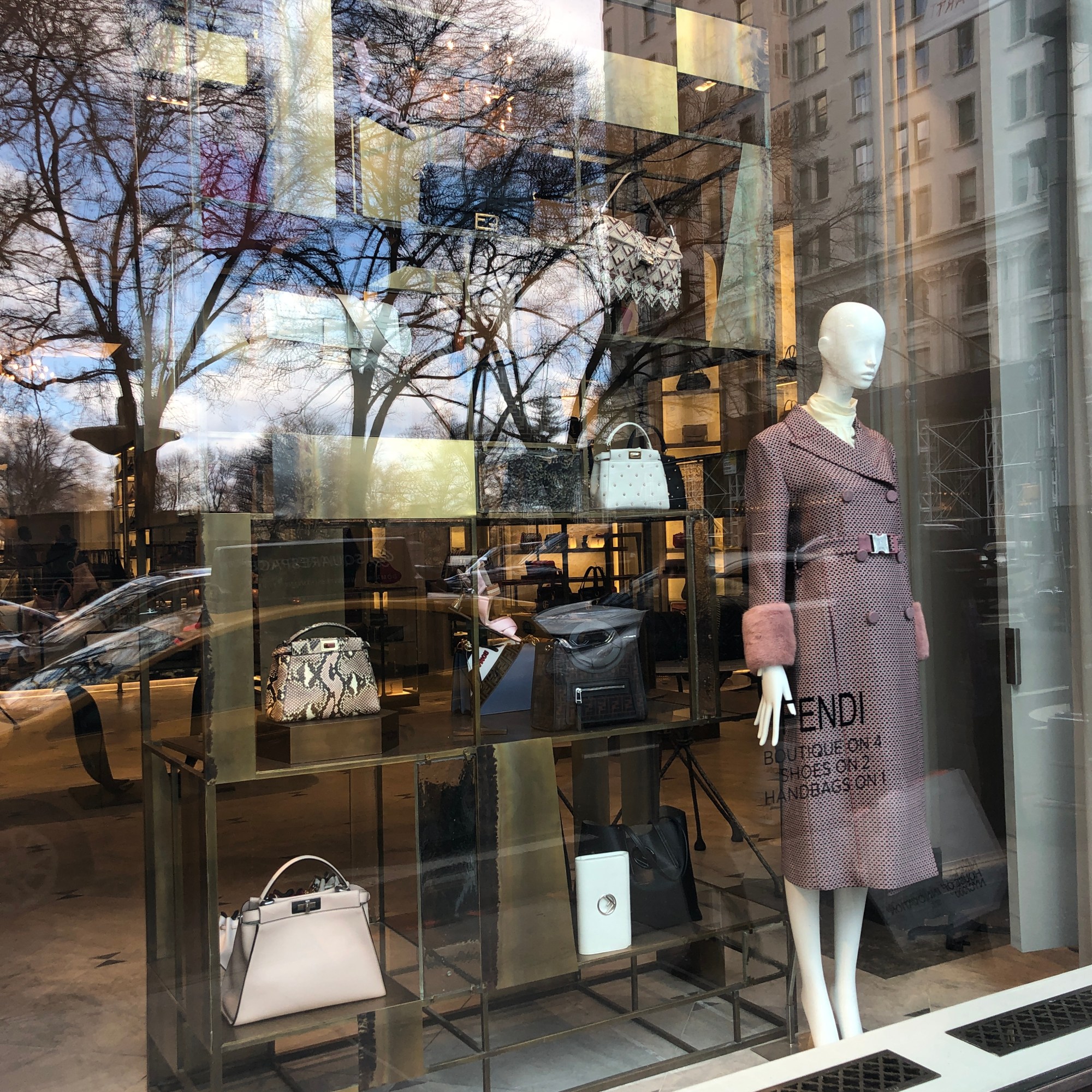
Bergdorf Goodman

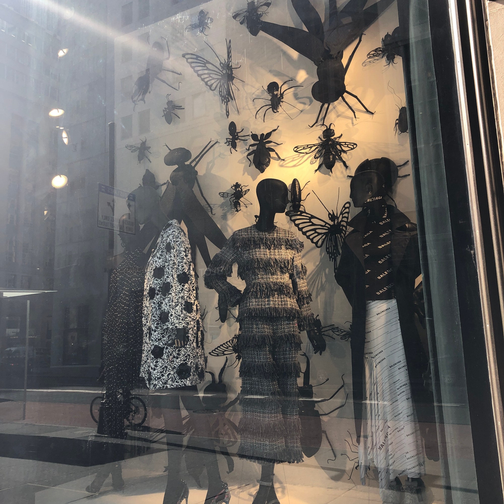
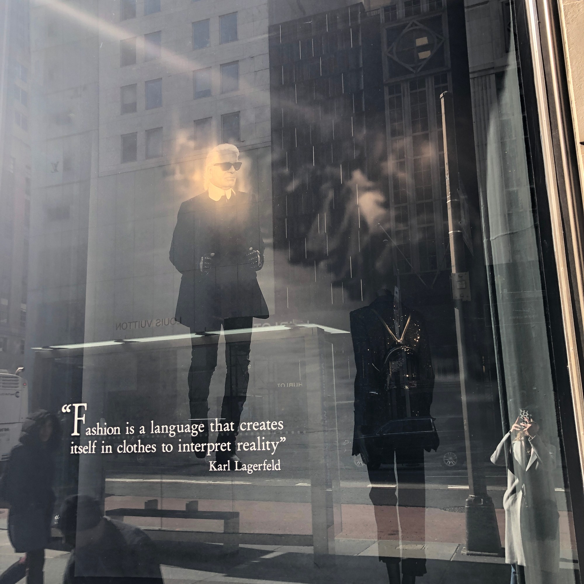
Photos taken by Emily Engibous
As a retailer who usually has great window displays, Bergdorf Goodman did not disappoint. However, there were many windows under construction, most likely due to the season beginning to change. Almost every window carried a different theme except the two dedicated to the “Newer than New” products. There was also a window dedicated to Karl Lagerfeld, may he rest in peace. There were colors, fabrics and silhouettes of all kinds.
Macy’s
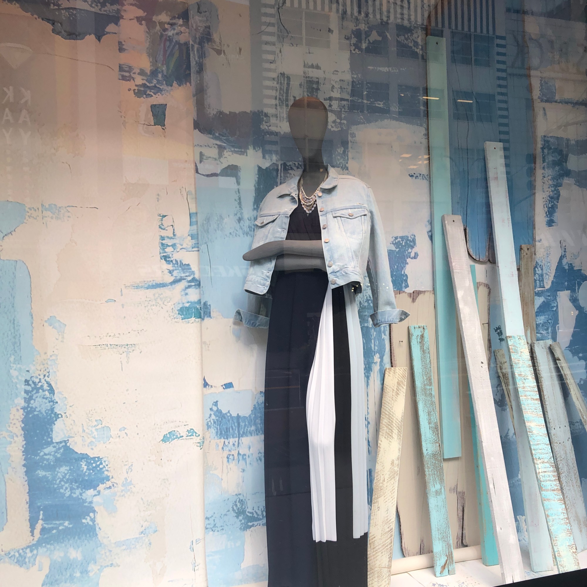
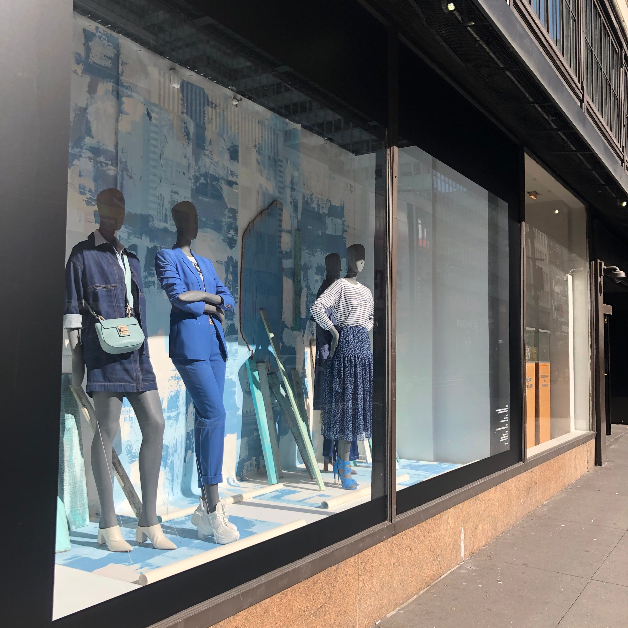
Photos taken by Emily Engibous
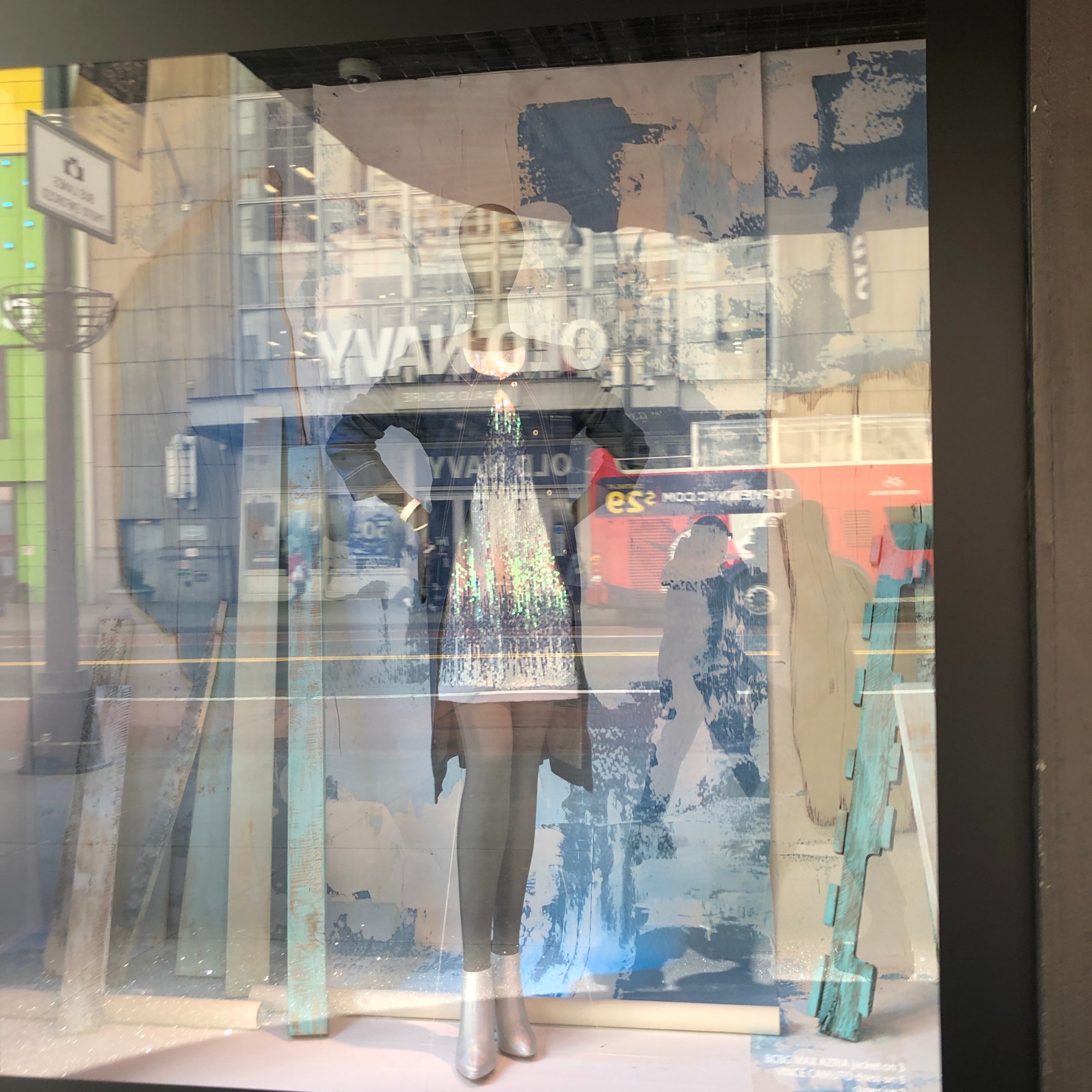
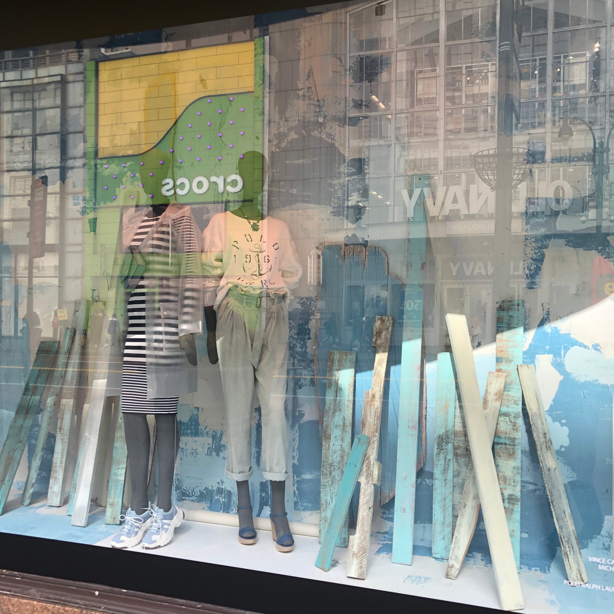
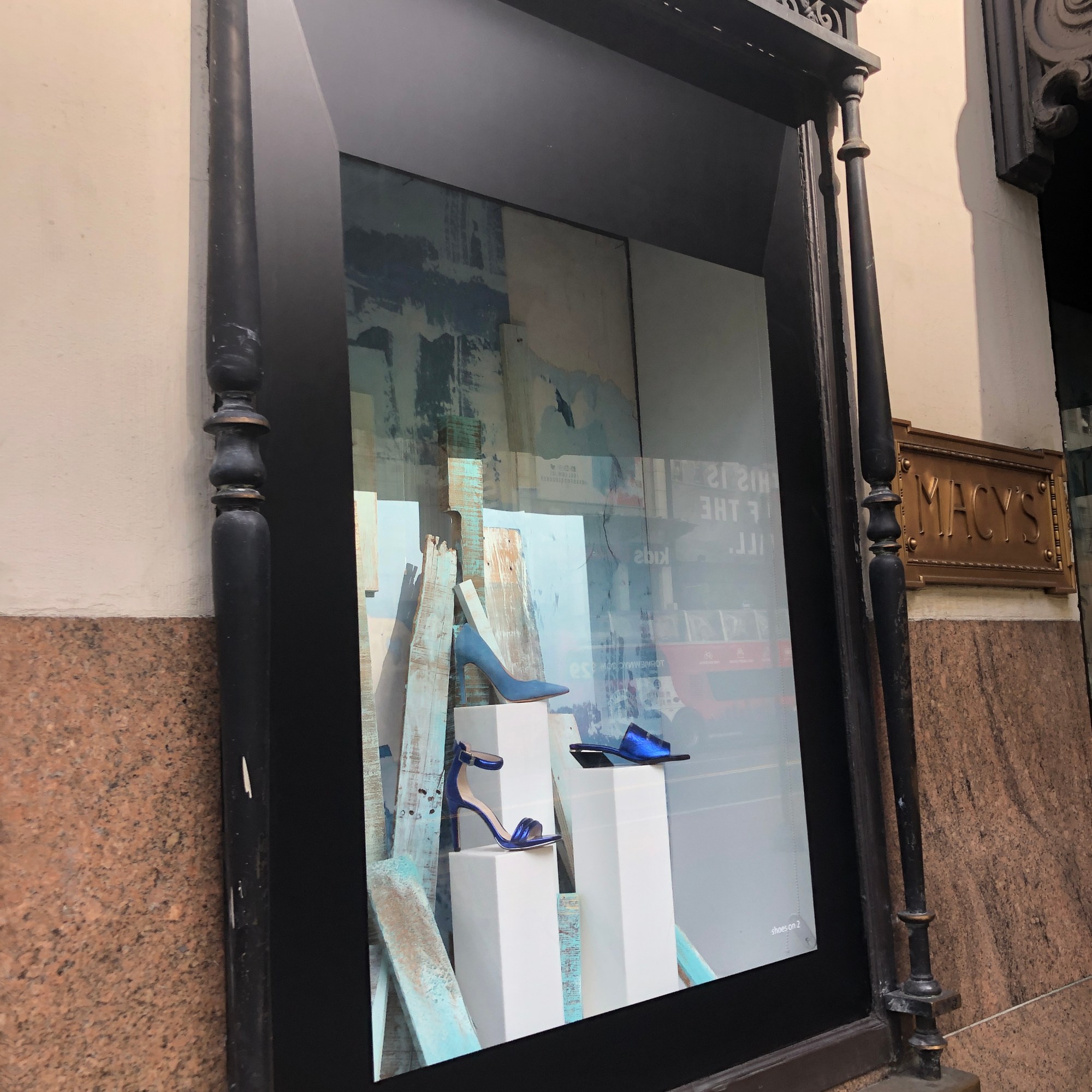
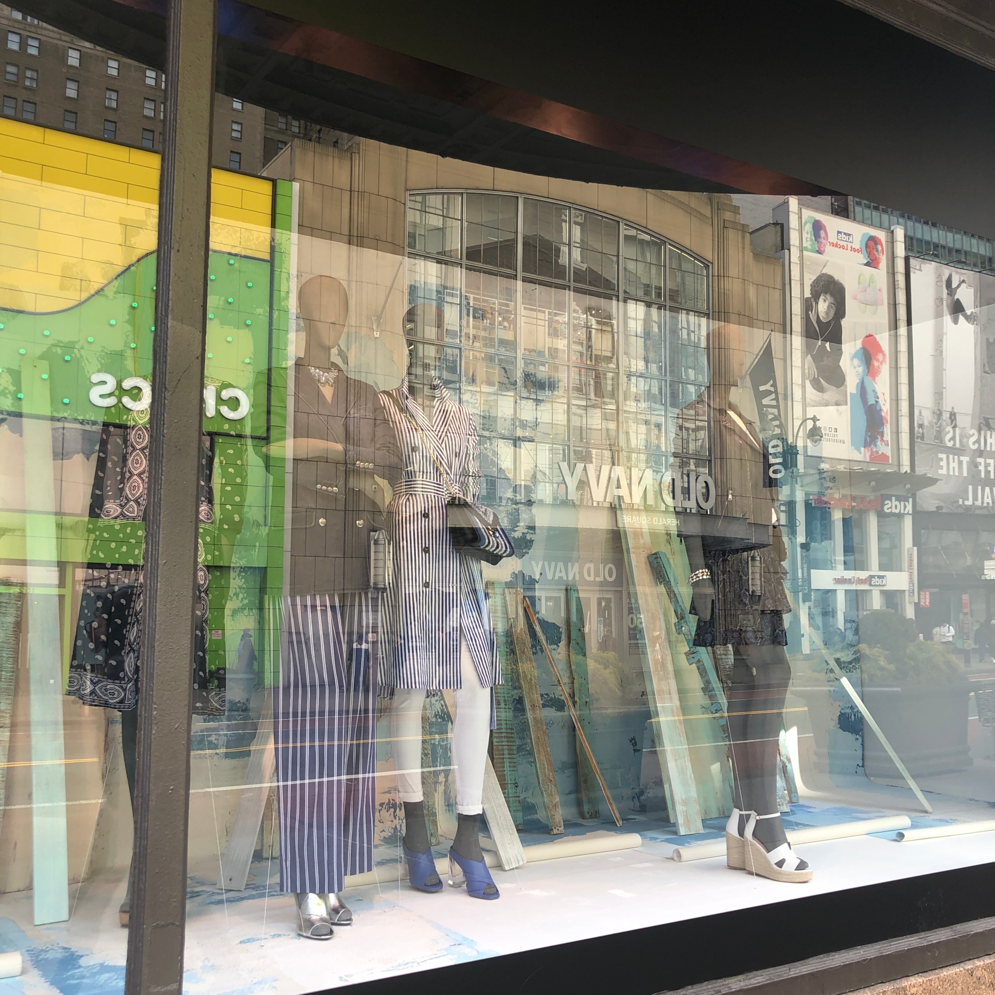
All of Macy’s windows included the same mood and color scheme. Blue was the main color and it had an overall vibe of the transitioning into the spring season. There was a good bit of denim and other cotton fabrics, and lots of white and blue stripes.
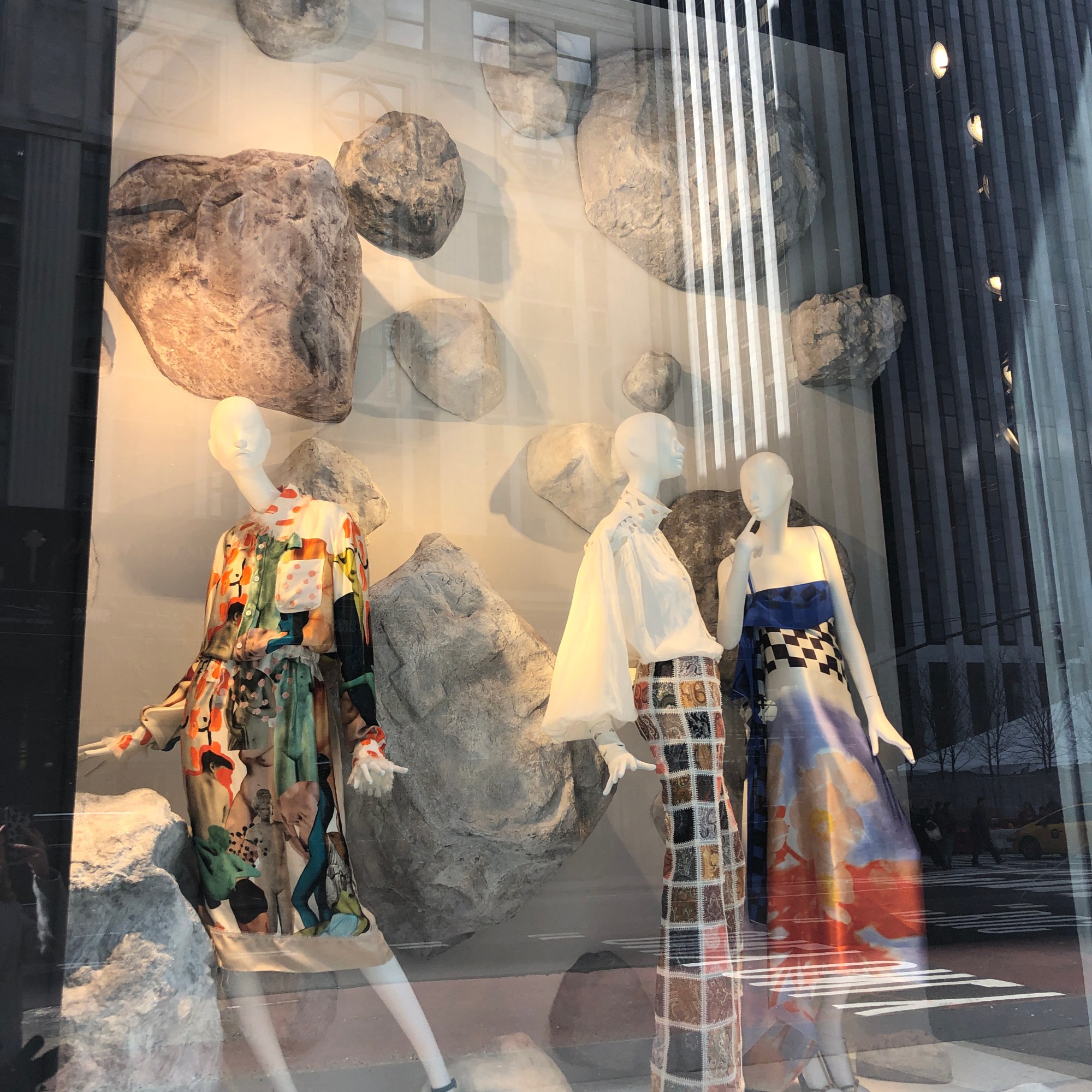
Versace
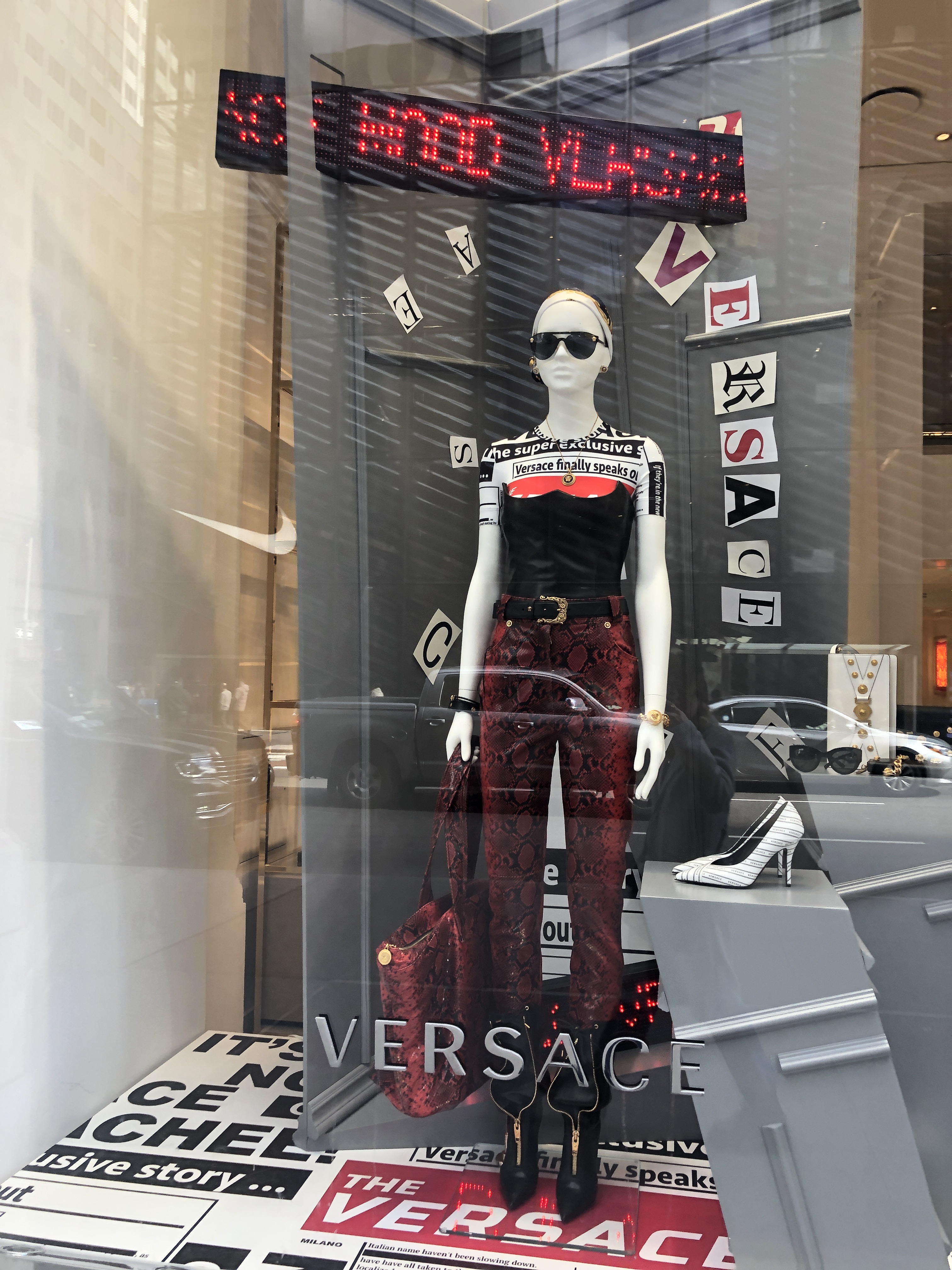
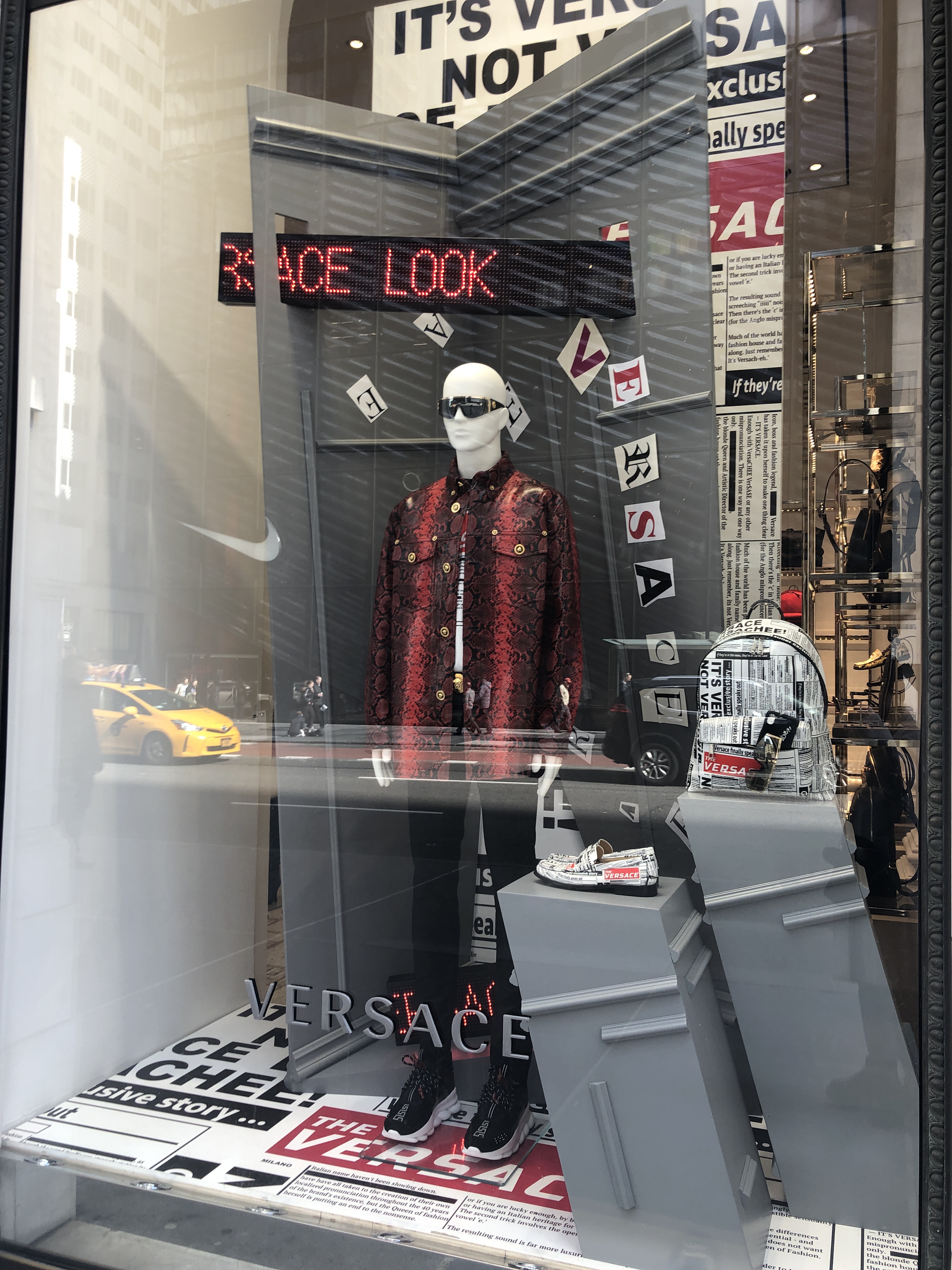
Photos taken by Emily Engibous
Versace’s windows were a completely different look than the other two previously mentioned. They were a lot more edgy and what is currently considered trendy. Both looks have a good bit of leather and the windows (and outfits) as a whole stick to a black, white and red color scheme.
Zara
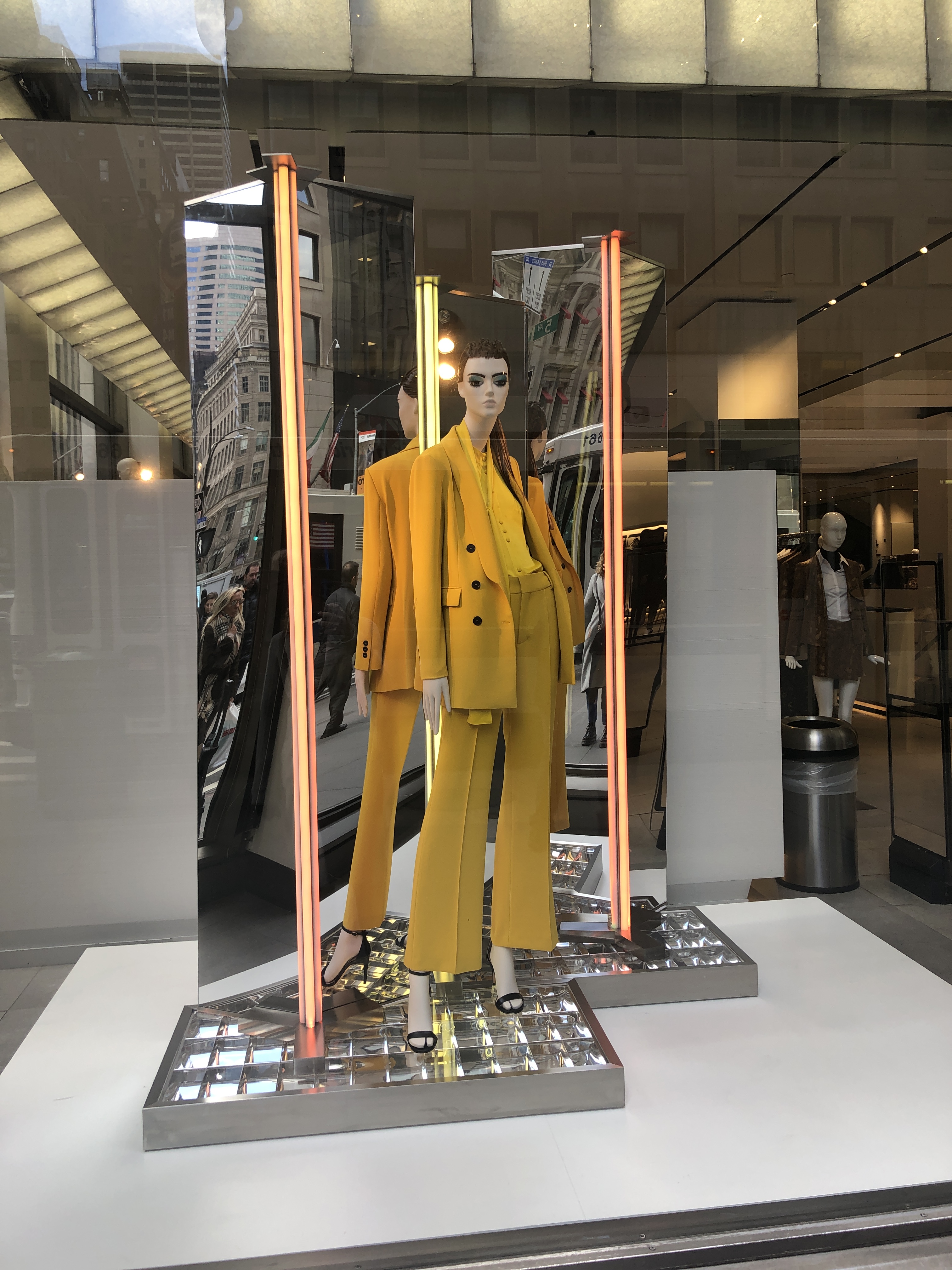
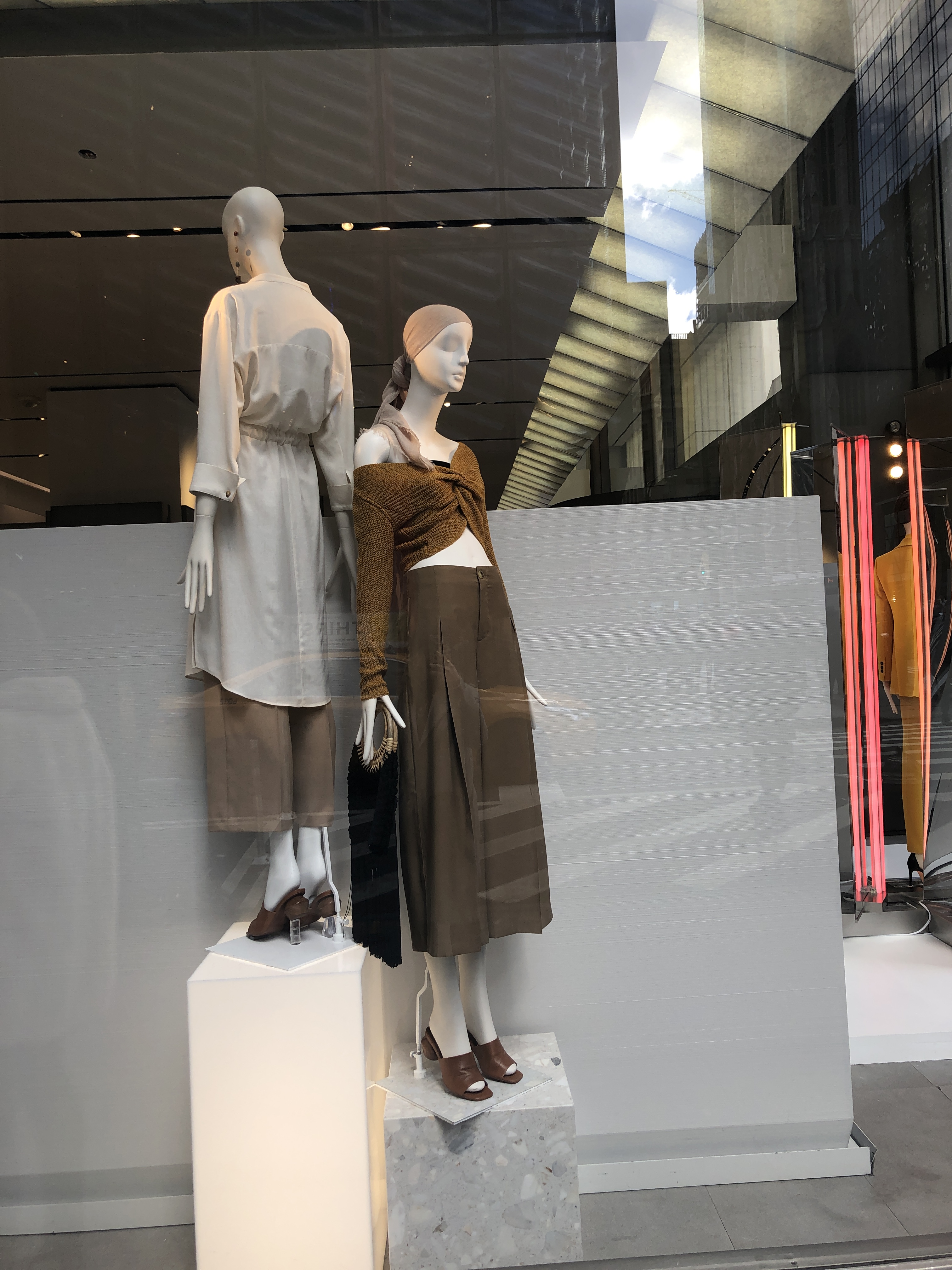
Photos taken by Emily Engibous
Zara’s windows were fairly simple, with a plain background that leaves the focus on the clothes. The silhouettes are quite loose and a-line while the colors are neutral with a pop of yellow. The fabric choices are light and primarily polyester or cotton blends.
Any similarities?
Looking at all of the window displays, they showed transitional clothing from winter to spring. The silhouettes were primarily loose and light, with the exception of Versace. However, all of the presentations were executed very differently and the stores on the luxury end were much more extravagant and creative. What do you think?
